Wednesday, February 26, 2014

A LITTLE LATE, BUT IT WAS GREAT!


The V&A doesn't serve regular "cafeteria" food, so it stands to reason that the trays the food is served on are far from standard as well. Love the refined floral in lieu of boring beige or something even worse!

I know that this blog has not seen many updates for a long time, but I've been so busy with work, marriage, travel, decorating our home, setting up my studio and life that I am just now getting a bit caught up. I took so many photos during my trip to London last Fall and so wanted to share my visit to The Victoria and Albert museum, even though it's a bit late in coming.


I hadn't been back to the V&A since 1989, but enjoyed it even more on my return visit.


The best museum food that I've ever tasted, hands down. I usually consider "good museum food" an oxymoron.


Both the exterior and interior architecture are quite impressive, with Prince Albert, Queen Victoria's beloved Consort, as the central figure and icon of this place and so many others around London.
You could spend days examining all of the art, artifacts, textiles and antiquities here.


These snapshots feature just a few highlights of what my husband and I saw.


The mammoth skylights are key to the openness and light here, in spite of the fact that the edifice hails from the Victorian era when "heavy" and "dark" were the norms of the period's architectural vernacular.


This piece was especially impressive because it was constructed entirely of glazed terracotta and so beautiful.


I hope they used some heavy-duty sinkers to hoist that massive carved architectural relic up on the wall!


This pagoda and the Oriental pieces were especially fascinating.


This handpainted wallpaper dates from around 1790-1800


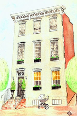
After lunch and several hours of perusing the art and historic treasures, we took a late afternoon stroll over to Hyde Park. I love this place and relished the space, light and people watching. Lots of darling little British charges with rosy cheeks tucked in their prams for a ride in the fresh air.


The V&A is certainly a "can't miss" if you are visiting London. You won't be sorry that you took a precious slice of time to see the world's finest museum of decorative arts!

Wednesday, February 19, 2014

FROM PUNXSUTAWNEY PSEUDO PROVINCIAL TO PALM BEACH PREP


I recently refurbished this Craigslist rescue piece for our dining area. My sharp-eyed, internet sleuth Mom scoped it out for me as she was doing one of her scroll-bys on Craigslist.
It was no small job -I won't lie to you- but with some hard work and my homemade chalk paint,
I was able to take a hideous pseudo china cabinet with cheap, slick wood finish (but a great bargain $$$ wise and with nice bones) and make it into something that is actually an asset to our decor. I was aiming at eclectic vintage Palm-Beachy. I was happy with the color (Pantone "Beach Glass") that I mixed into my chalk paint recipe (courtesy of Pinterest) and then I did a bit of a watered-down white rub over it once it was painted. I finished the piece with hand waxing for long-lasting protection and durability. I started the painting process when Mr. Annechovie was out of town, so when he returned and saw the color, I could tell he was a bit - shall we say- "jarred" initially (read: his eyebrows went up a little). It did look a bit like a bold Jamaican fisherman's shack at first. I am thankful that I am married to a man who trusts my eye and gives me ample latitude in my creativity and artistic pursuits, especially those extending to our home. Once he saw the finished product and the toned-down finish, he was very pleased and continues to tell me how much he now loves it. As you can imagine, being married to me is not for a taupe-loving colorphobe who prizes mild, mainstream and generic interiors. A guy's got to have guts and an open mind to marry an artist.
We keep coral, sea fans and shells, along with some beach finds we've found on our travels that hold special meaning to me and my husband.


the "before" - like an 80's version of what I call "Rooms to Go Generic Mock French" or GMF

Moral of the story? Keep your eye out for pieces that may have good construction and bones, yet lack appeal because of cosmetic defects or beauty deficits......you never know - your vision, TLC and some elbow grease could turn an unloved ugly duckling into a cherished beauty!

Wednesday, February 12, 2014

ANNECHOVIE AND HGTV


I want to say thanks to HGTV and Rae McConville for featuring my new ginger jar decal in the March 2014 issue of HGTV Magazine. It was great partnering with them on this creative project idea. The decal is versatile and can be used on many surfaces, not just a vase. It's available with or without the ebony wooden base here

 
http://clickserve.cc-dt.com/link/click?lid=41000000028477615